

Material Security's design philosophy focuses on transforming complex security data into actionable signal by removing unnecessary friction and providing clear visualizations.
Security tools surface complex information, often in very high volumes, but the people using them need to act quickly and confidently. Closing that gap is one core design challenge I navigate at Material Security: removing complexity where it adds noise while preserving the signal. We recently launched two sets of work that illustrate how we thread this needle: a new evidence visualization for new session-based file detections and a set of improvements to message search.
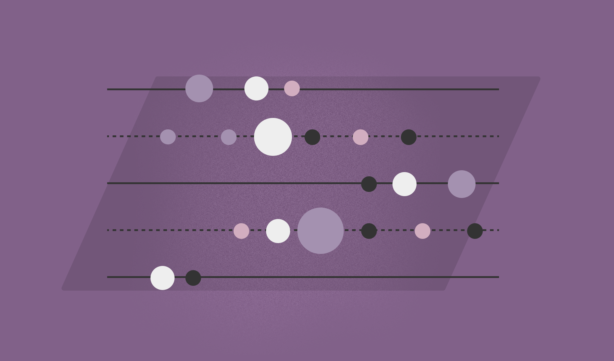
Three dimensions, one glance
In spring of last year, we upgraded our charting library to make it easier to explore new graph types for Material's reporting surfaces. It's made it possible for us to add a number of new data visualizations to our product: Sankey charts that showcase how messages flow through various detection types and classifications, radar diagrams that highlight attack tactics, and line charts that allow the user to drill down into issues by entity and resolution status.
We recently launched a new set of detections that identify potential data exfiltration or ransomware-style behavior within their Google Drive environment. Building this out, it quickly became clear there was an opportunity to explore a new visualization. These detections look at actions taken across a large number of files over time to provide a risk assessment. The challenge was representing aggregate, session-level behavior rather than a single suspicious event. It’s a different shape of data: the story isn't told by one variable, it's a pattern formed by many.
We considered several approaches. A timeline could show the sequence of actions, but it would struggle to convey scale and file sensitivity at a glance. A simple table would give precision, but no sense of how events unfolded throughout the session.
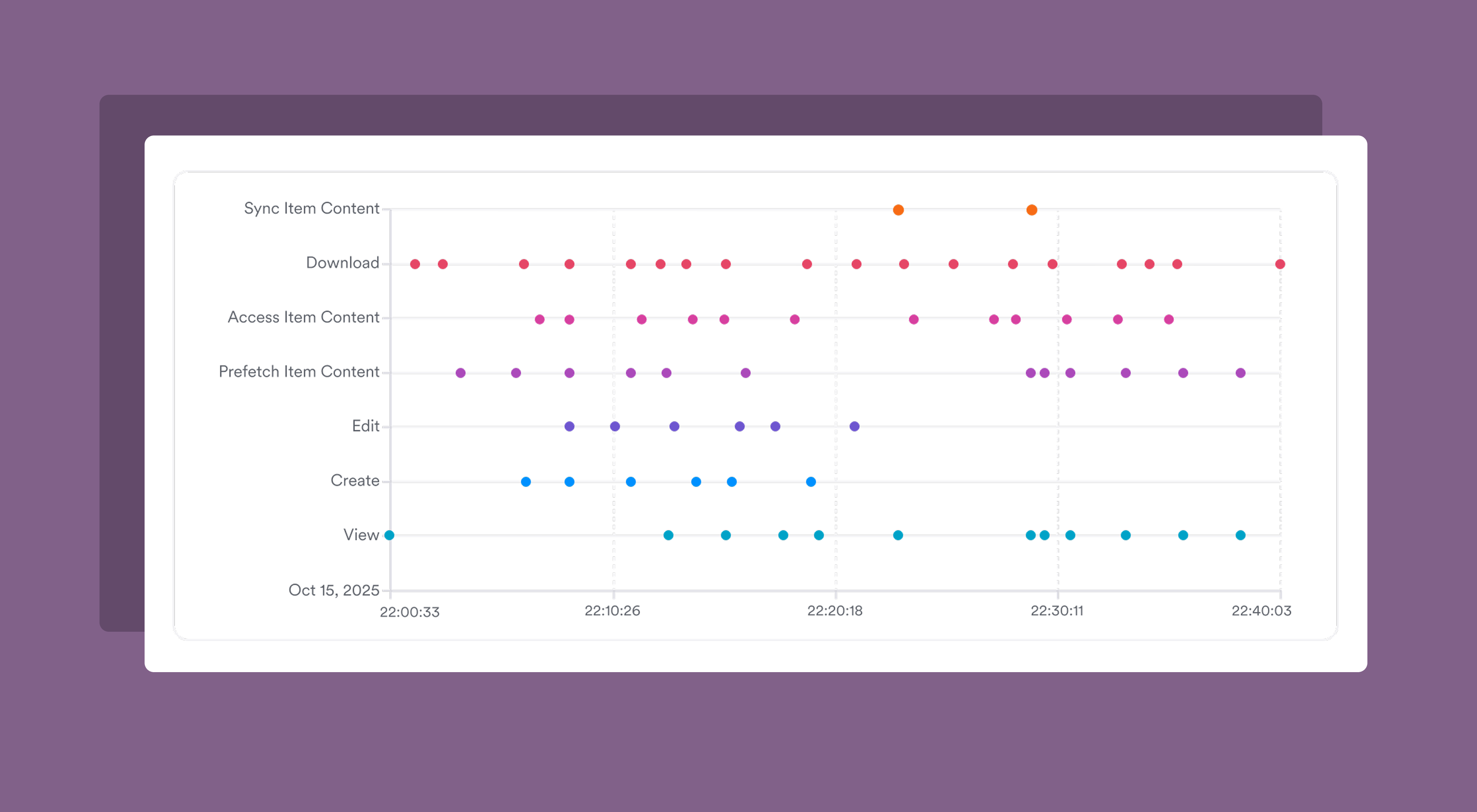

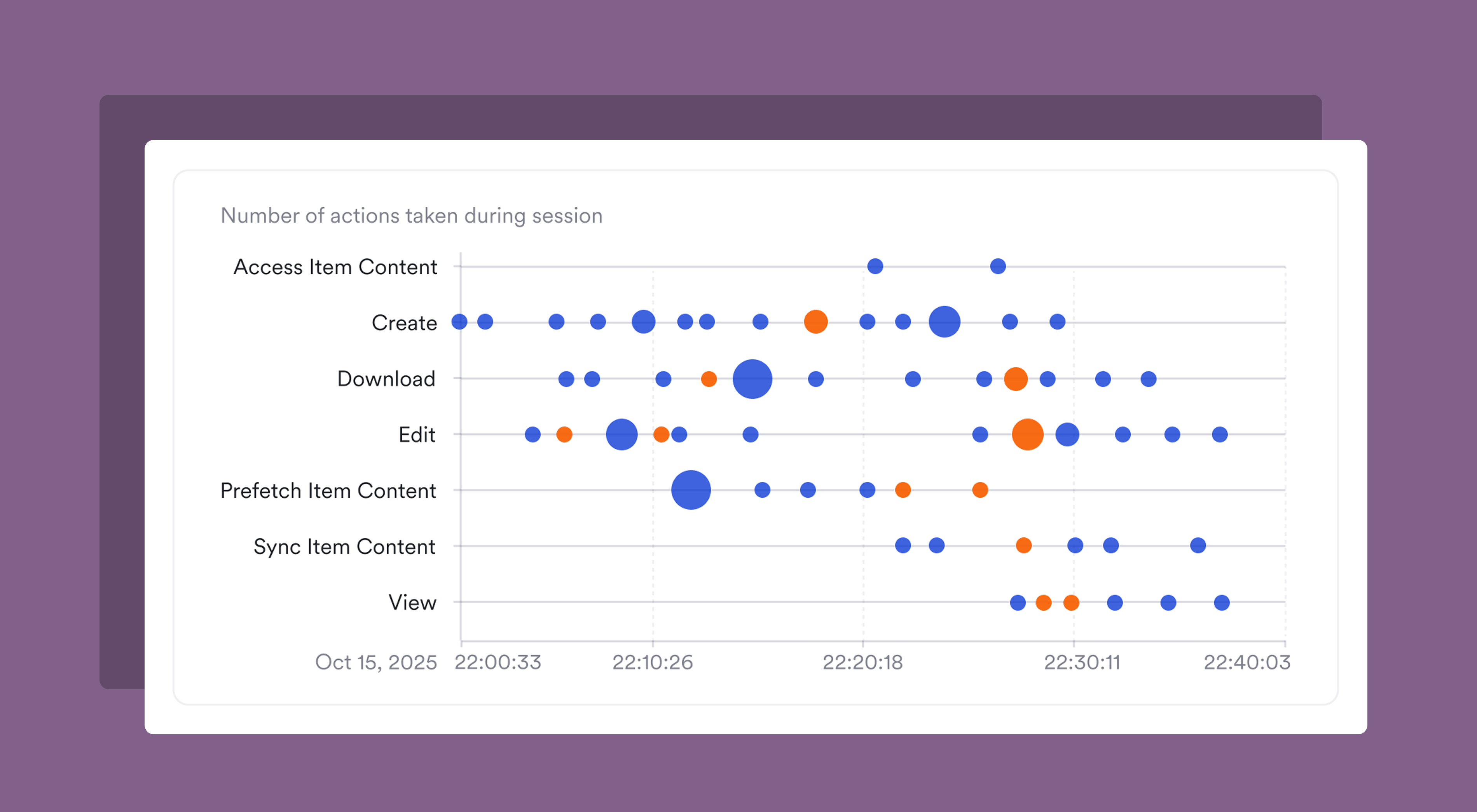
We ended up choosing a bubble chart for this evidence because it could encode three dimensions in a single view: actions taken over a given session (broken out by action type), volume of actions taken, and the sensitive nature of the files being actioned. That density is intentional: an analyst triaging this alert needs to grok the shape of the session quickly, not scroll through multiple panels of data to assemble a picture themselves.
We paired this high-level session view with a more in-depth table that listed the files actioned during the session, giving reviewers two levels of abstraction to work with: a visual read of the session's shape, and a direct access point to pivot into the details of each file.
Meeting users where they already are
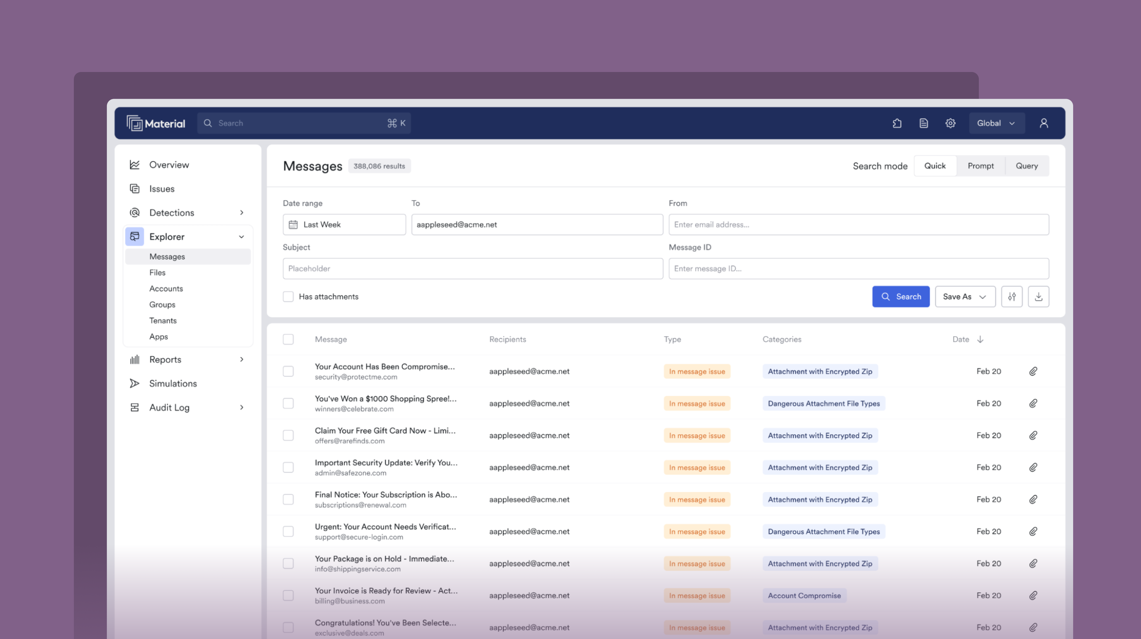
We also recently released a wide set of improvements to message search. These updates share a common thread: reducing the travel time between a user's intent and the end result of their effort.
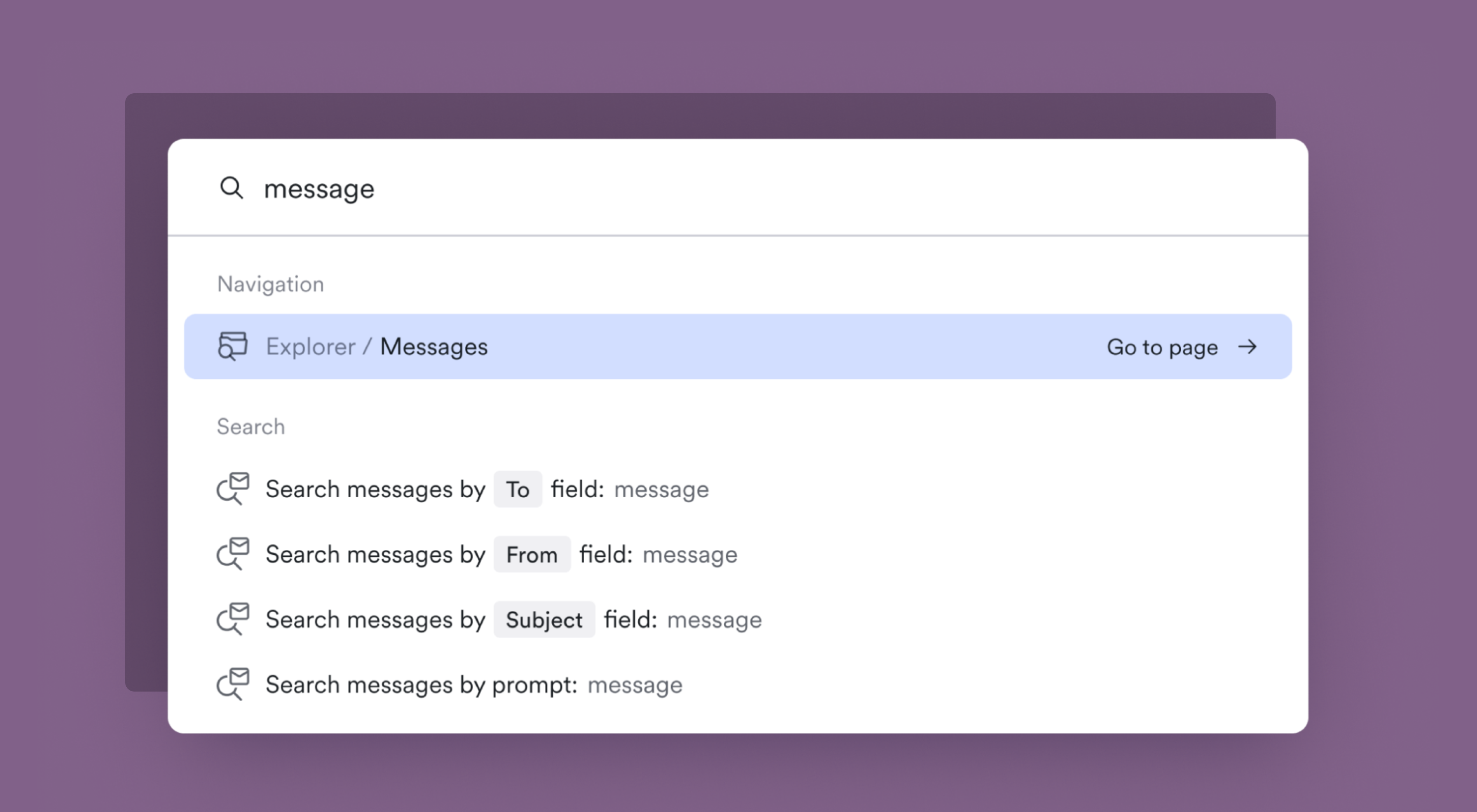
The first change was simple, but extends a key interaction pattern in Material that we aim to continue to improve. We added an option to the global CMD+K palette that provides a quick pivot into message search from anywhere in the app. Before, to launch a search, users had to navigate to the Explorer section and into message search.
This is a small moment of friction, but if it’s one that happens when analysts are deep in triage and need to quickly look something up, why not remove it? We’ve heard from customers that improving our keyboard-first workflows throughout Material is an investment worth making.
From there, we focused on the search experience itself. In researching how our customers used message search, we learned that the vast majority of message queries were simple searches on a single field: a recipient, a sender, or a subject line. For these cases, the work to form a full MQL query creates unnecessary overhead. So we built a Quick search: a form-based mode that lets users search on specific message fields directly. It's intentionally designed to look and feel like the search patterns you'd expect in an email client. It lets simple searches stay simple.
From natural language to query language
For more complex searches, Material Query Language (MQL) offers quite a few operators by which to slice the email corpus. But even with autocomplete, there's a learning curve. For our customers with GenAI features enabled, we launched a new search mode that takes a natural language prompt and generates a correctly-formed MQL query.
A key design decision here was making the system's interpretation visible to ensure accuracy. When a natural language prompt is processed, the user sees the generated MQL query, not just the results. That transparency is important: we aim to build trust in the system output, while also giving users a chance to easily pivot into Query search mode.
Because these queries have a few more processing steps at work, we also added distinct loading states for generating the query and running the search. If the system is unable to generate a query from the input, the loading state reforms into a follow-up prompt. We wanted to balance ease with clarity, not hide the systems at work.
Signal, not noise
Each of these features tackles a different surface of the product, but they share a design philosophy: they aim to make complex data actionable without dumbing it down. Our customers are experts in parsing this kind of information, but they're also busy, often triaging threats and risks under significant time pressure. When we add new visualization or interaction patterns inside Material, the goal isn't glitz for its own sake, it's clarity. Our design aims to remove the complexity where it adds noise and make it straightforward to unpack the core signal from the data in front of you.
That's one question I keep coming back to in this work: where is complexity serving our users, and where does it just inhibit rapid response? It's a moving line that depends on the data, the workflow, and the task a user aims to complete. Getting that balance right is just one thing that makes designing security software endlessly interesting.